Getting started
The app shell — present on every tab
Terrafa Continuum organizes your work into seven tabs. Each tab opens a different workspace: the data sources catalogue, the data tree, the transfer function editor, the model network, the dashboard, the site map, and the CSV export pipeline.
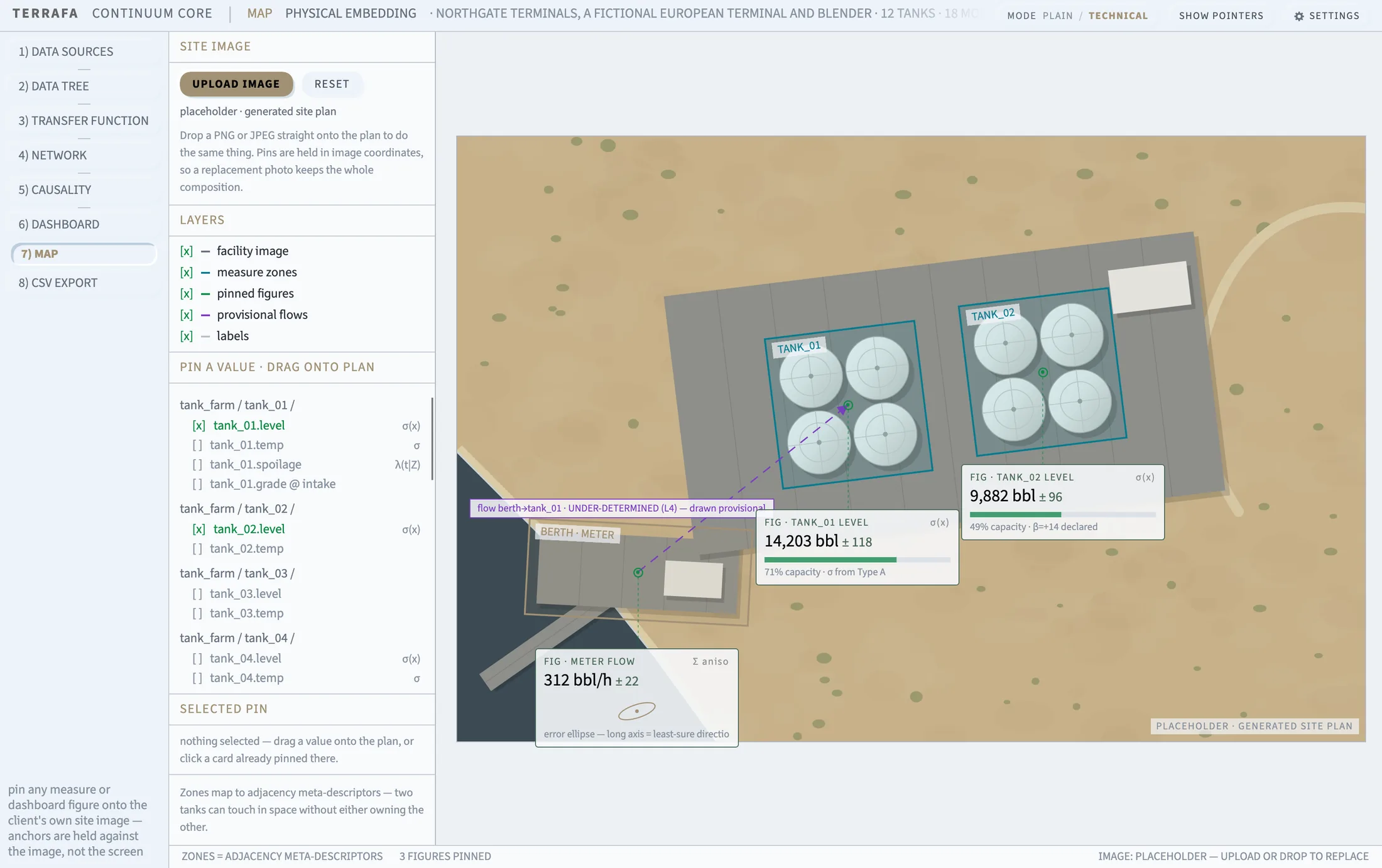
The tab strip runs down the left-hand side of the window, numbered 1 to 7. Click a tab to switch workspaces. Press and drag a tab along the strip to reorder it — the numbers update to match the new order.
The top bar
The top bar stays visible on every tab, with four controls.
- SETTINGS opens the settings panel. General settings are covered in a separate guide.
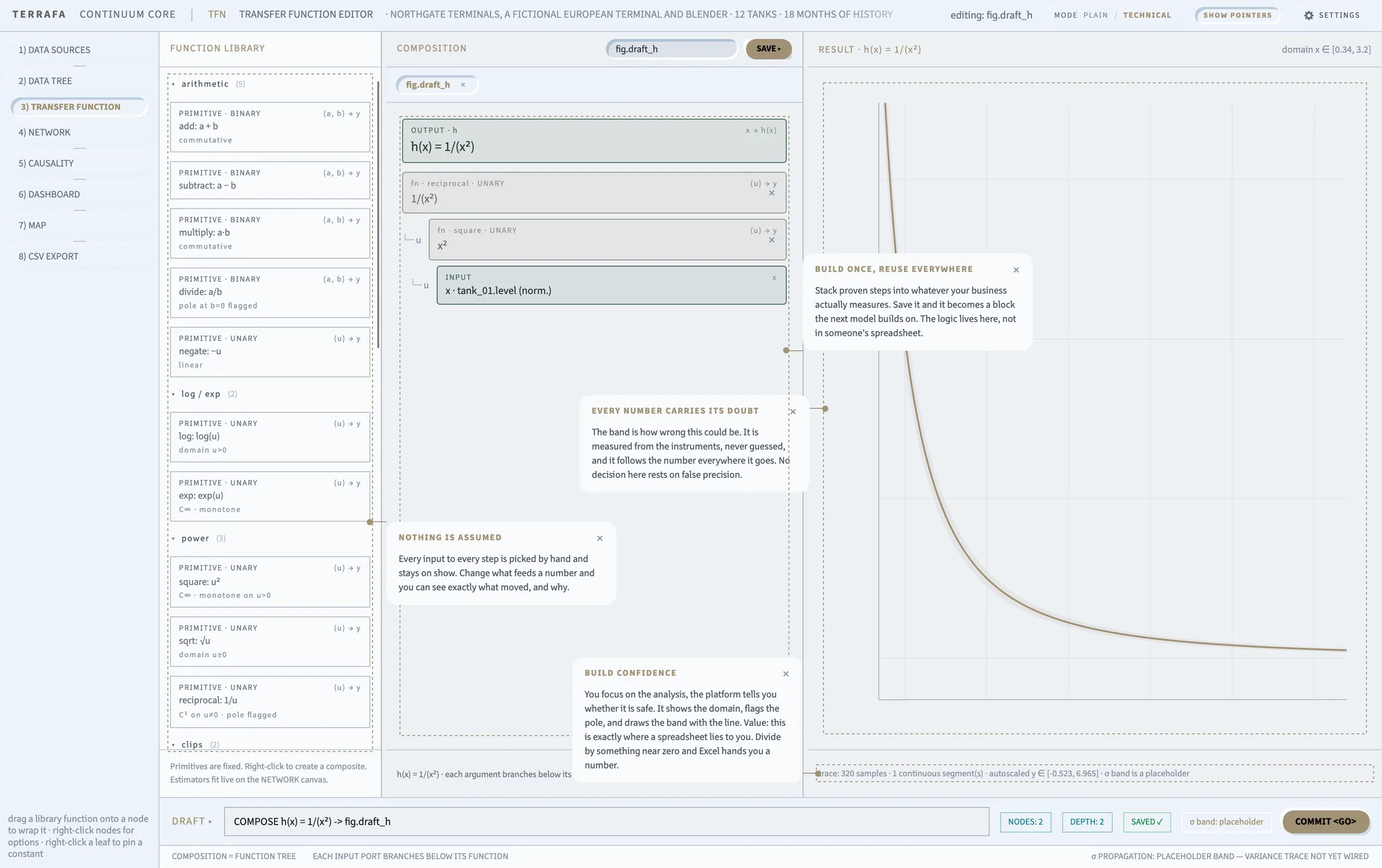
- SHOW POINTERS turns the on-screen hint callouts on or off. Each tab has its own callout, pointing at the control most people miss first.
- PLAIN / TECHNICAL switches builder mode. Technical mode shows the builder panels down the sides of each workspace. Plain mode hides them.
- TERRAFA — click the brand mark in the corner to open the contact dialog.
Resizable panels
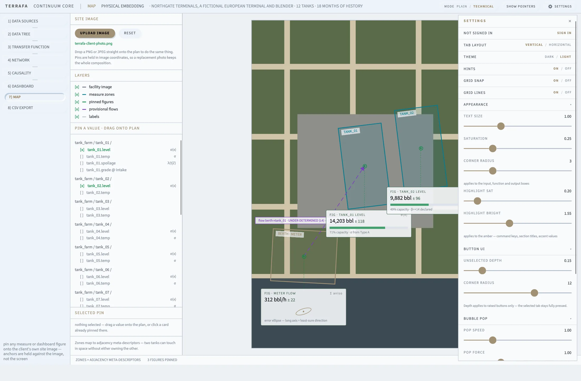
Most tabs show one or two side panels next to the main workspace. Drag the thin bar between a panel and the workspace to resize it. Terrafa Continuum remembers each panel's width the next time you open that tab.
The guided tour
The first time you open Terrafa Continuum, a guided tour starts automatically on the Map tab. It walks you through Map, Dashboard, and Network, then Transfer Function and Data Tree, and finishes on CSV Export.
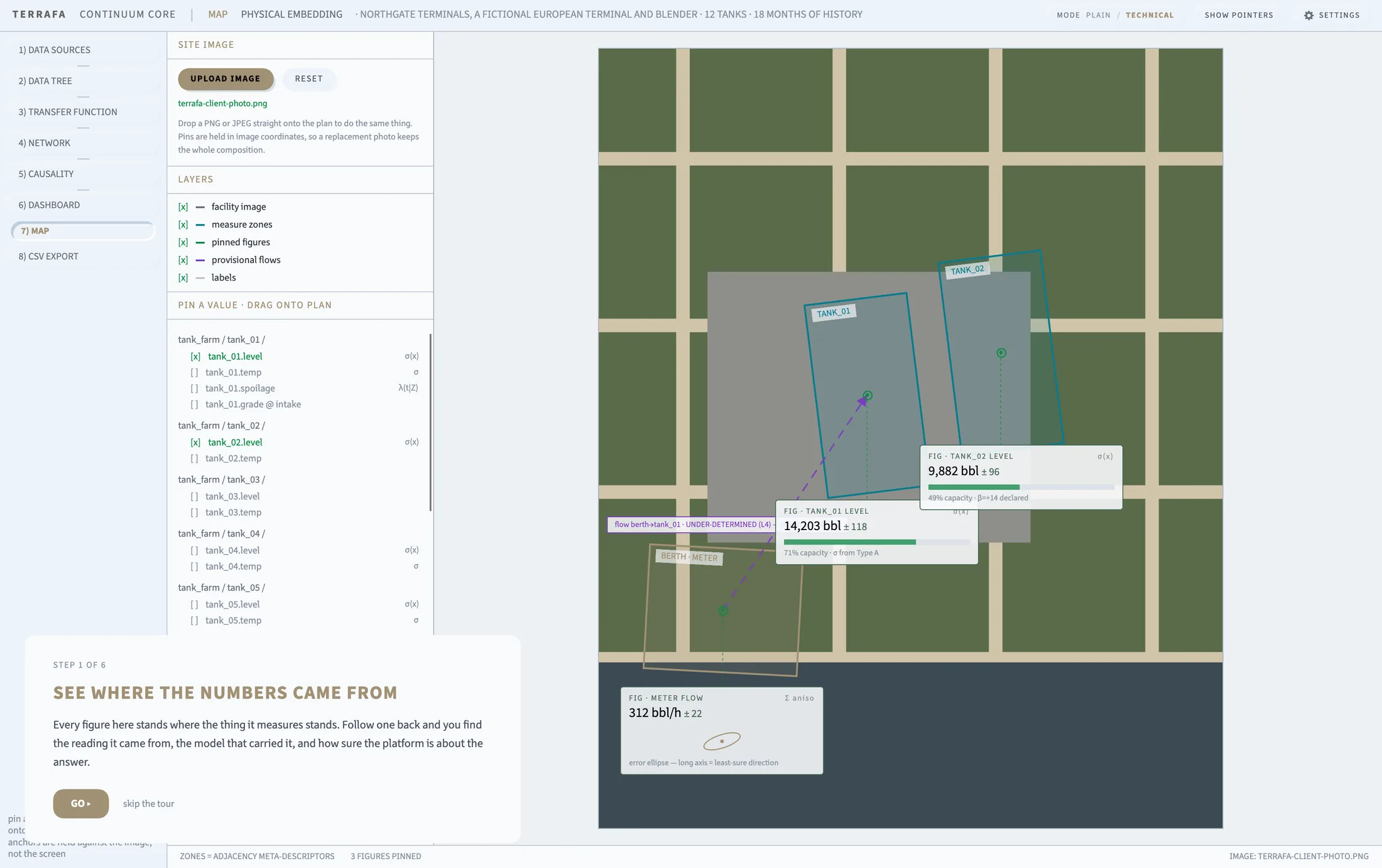
After the tour ends, a pointer callout lights up on each tab, explaining the one thing worth knowing first. Turn callouts off at any time with Show Pointers in the top bar.
Every number carries its uncertainty
Across every tab, Terrafa Continuum tracks not just a value but how sure it is of that value. This uncertainty travels with the number as σ (sigma).
A chart, table, or tile only draws a value's uncertainty band when it has one to show. Where a value has no σ, Terrafa Continuum leaves the reading blank rather than draw a false confidence.
Settings and sign-in are not covered in this guide. A separate guide covers general settings and connecting your own data.
Data Sources
Search the catalogue, mount data, import a CSV
Screen layout — catalogue on the left, schema preview in the center, mounted subtrees on the right.
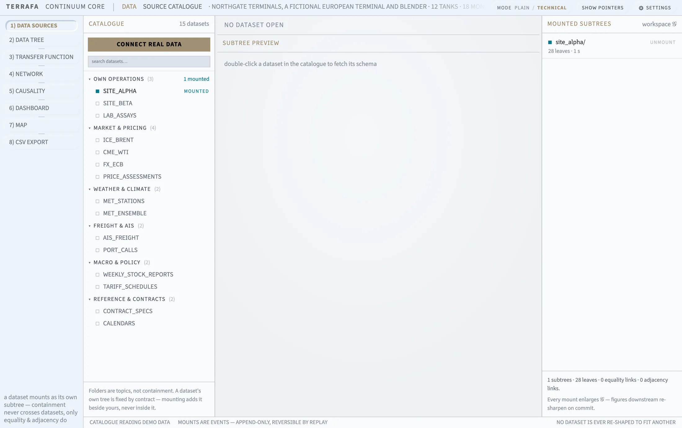
The Data Sources tab is your catalogue of datasets. Search it, mount a dataset into your workspace, preview its schema, and import your own CSV files.
Find a dataset
Type into the search box at the top of the Catalogue panel. Terrafa Continuum filters the list as you type and reports how many datasets match. Datasets are grouped by topic — click a topic heading to collapse or expand its group.
Preview a dataset
Click a dataset once to select it. Double-click to open its schema in the Subtree Preview panel in the center. The header shows its topic, mount state, provider, contract, cadence, coverage, licence, and shape.
Choose an x axis
For a live or local dataset, click the X Axis chip in the preview header, then choose a column from the list of orderable columns. Terrafa Continuum re-reads the dataset ordered by that column and reports how many rows it read.
If the underlying table has more than one row per axis point, the preview warns you. Fix the table before charting it.
Mount part of a dataset
- In the schema tree, tick the checkbox next to the object or measurement you want.
- Confirm in the Add to Tree dialog, which shows how many objects and leaves this adds.
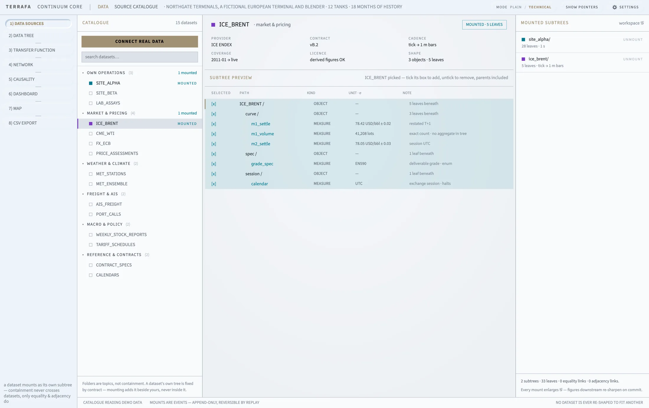
Unmount part or all of a dataset
- Untick the checkbox, or right-click the row and choose Remove.
- Confirm in the Remove from Tree dialog, which shows what this removes, including any links it severs.
To unmount a whole dataset at once, find it in the Mounted Subtrees panel on the right and click Unmount.
Import a CSV
- Under Local Workspace, click Set Up Local Workspace and choose a folder, if you have not already.
- Click Import CSV and pick your file.
- Terrafa Continuum parses the file and reports its row and column counts, along with any warnings.
- Confirm or edit the dataset name, then confirm the import.
Terrafa Continuum converts your file to Parquet, reports progress as it converts, and opens the new dataset's schema when it finishes.
Data Tree
See the shape of every dataset, and how they link
Screen layout — subtrees on the left, event log on the right.
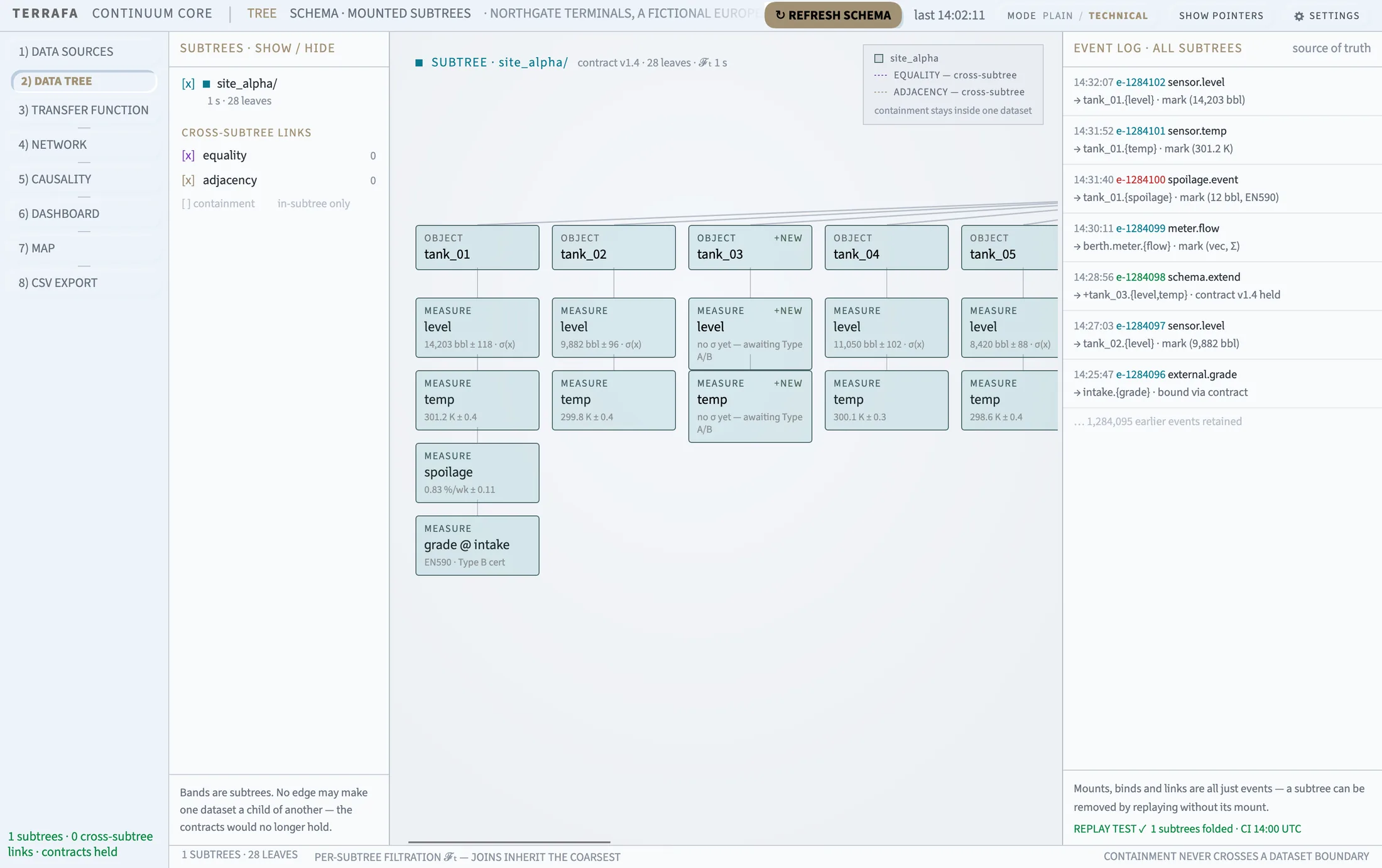
The Data Tree tab shows the shape of every dataset you have mounted: its objects, its measurements, and how it links to other datasets.
Reading the canvas
Each mounted dataset draws as a horizontal band, headed by its name, contract, leaf count, and cadence. Objects fan out from the header, with their measurements stacked underneath. Click ↻ Refresh Schema in the top-right to re-read the schema.
Show or hide a dataset
In the Subtrees panel on the left, untick a dataset's checkbox to hide its band. Tick it again to bring the band back.
Link two datasets
- Right-click the node you want to link and choose Link To.
- Choose a link kind: Equality, for the same underlying thing across datasets, or Adjacency, for context without containment.
- Pick the target node from the list of other mounted datasets.
- Click Link.
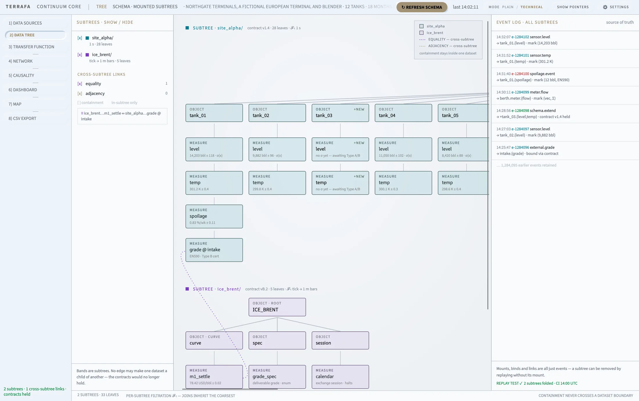
Containment never crosses a dataset boundary. Only equality and adjacency links do.
Remove a link
In the Subtrees panel, find the link under Cross-Subtree Links and click it to remove it. You can also right-click the linked node on the canvas and choose Remove, followed by the link's name.
Unmount a dataset
Right-click the root node of a dataset's band and choose Unmount Subtree. This action is available on root nodes only.
The event log
The panel on the right lists every mount, bind, and link event across all your datasets, in order, with a timestamp and colored id.
Transfer Function
Compose and save the functions your model uses
Screen layout — library, then the composition tree, then a live result chart.
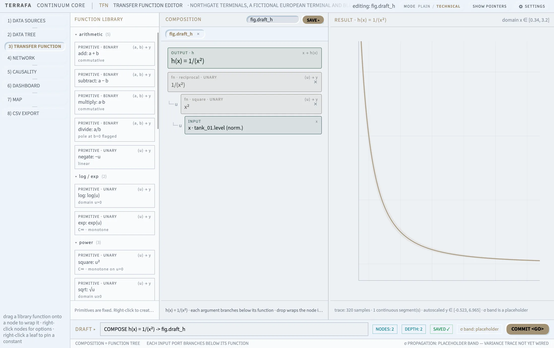
The Transfer Function tab builds and saves the math functions used across your model. Compose a function from library primitives, preview its curve, then save it so it appears wherever you need it, including as a target from Network's Change Function.
The function library
The library panel on the left groups functions by kind: primitive, estimator, and your own saved composite functions. Each entry shows its signature and a formula preview.
- Drag a library entry onto a node in the composition tree to wrap that node in the function.
- Right-click a library entry for Apply to Output, or Create Function to start a new draft.
Build a function
- Right-click the library panel background and choose Create Function, or open an existing draft tab.
- Drag a function from the library onto the composition tree. Drop it on a node to wrap that node, or on empty space to wrap the whole output.
- Right-click any node in the tree for further options: Add Argument, Remove, Unwrap, Set to x, Set Constant, or Move Up / Move Down.
- Edit a constant's value directly in its card.
Save your function
- Type a name in the field above the composition tree.
- Click Save.
- If the name is already used, confirm Overwrite to replace it.
Terrafa Continuum rejects a blank name, the name of a primitive function, or bare x.
Work on more than one function
Every draft you open gets its own closable tab. Closing a tab with unsaved changes prompts you to Save, Discard, or Cancel before it closes.
The result panel
The panel on the right plots h(x) live as you edit, across a fixed domain. A placeholder band shows where the function's uncertainty will appear once it is wired to real data. The footer reports the sample count, segment count, and y-range.
Network
Build your model on a wiring canvas
Screen layout — elements panel on the left, canvas fills the rest.
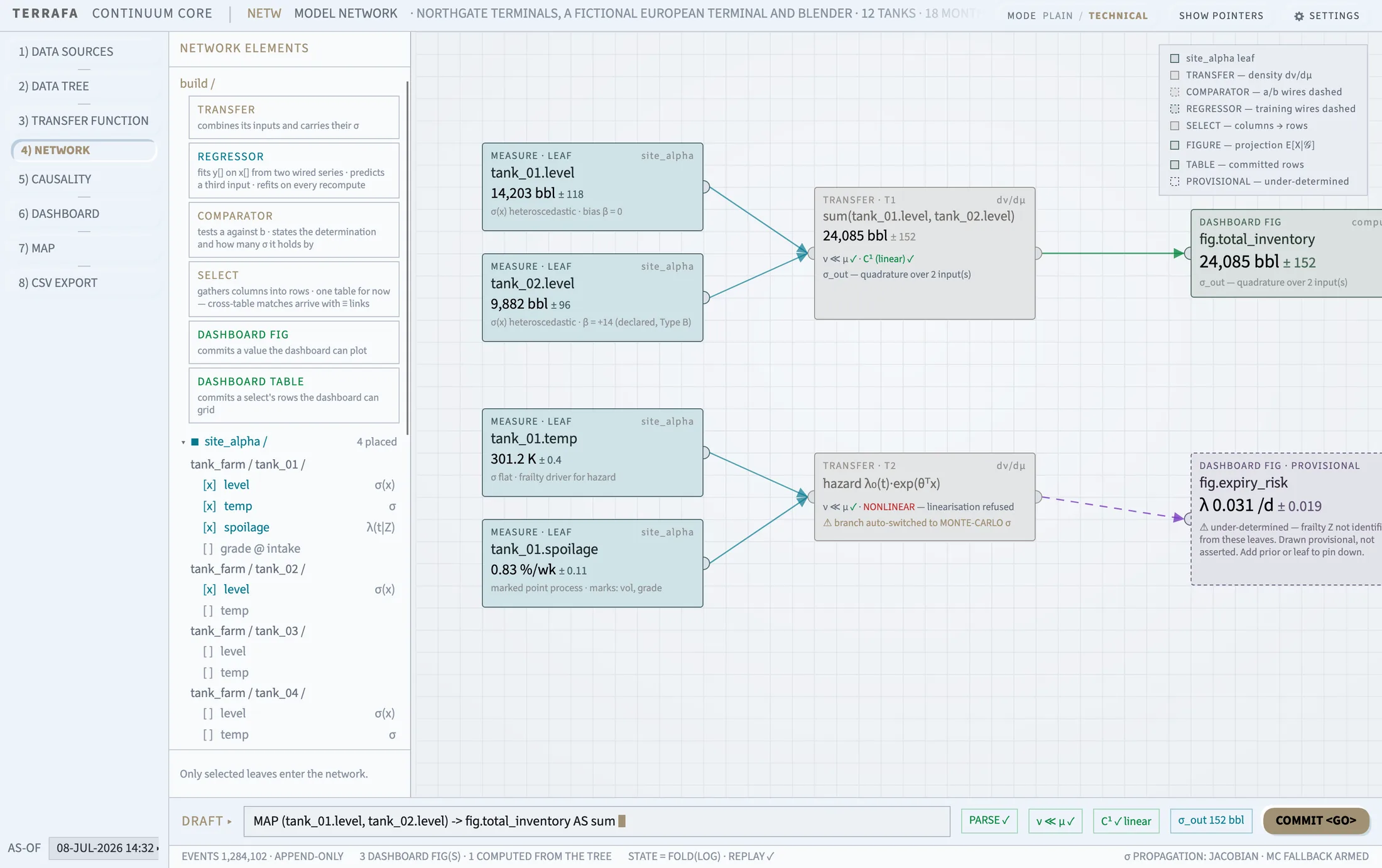
The Network tab is where you build your model. Drag raw measurements onto the canvas, wire them through transfer functions, estimators, comparators, and select nodes, then publish the result as a dashboard figure or table. Every wire carries a value and its uncertainty.
The canvas
- Pan — click and drag an empty area of the canvas.
- Zoom — scroll the mouse wheel. Terrafa Continuum zooms toward your cursor, between 0.4x and 2.5x.
- Snap to grid — when snap is on, nodes magnetize toward the grid as you drag them, and hard-snap when you release.
The elements panel
The Network Elements panel sits on the left, with two sections.
- Build lists six node types you can drag onto the canvas: Transfer, Regressor, Comparator, Select, Dashboard Fig, and Dashboard Table.
- Measures lists every measurement from your mounted datasets, grouped by dataset and object. Click a group heading to collapse or expand it. Drag a measurement onto the canvas to place it as a leaf card.
Hover over a row in the panel to highlight the matching card on the canvas, and the reverse.
Wire two nodes together
- Find the port on the edge of the node you want to connect from.
- Drag from that port to a port on the target node.
- Release. Terrafa Continuum checks the connection is valid before it draws the wire.
Node types
- Measure — a raw reading from a mounted dataset.
- Transfer — applies a transfer function to its input. Shows whether the function is linear, and if not, that Terrafa Continuum has switched to Monte Carlo for uncertainty.
- Regressor — trains on x and y ports, then predicts.
- Comparator — compares two inputs, a and b, and reports which is greater, with a confidence level.
- Select — gathers rows into a table.
- Dashboard Fig / Dashboard Table — publish sinks. Nothing wires out of these.
Publish a figure or table
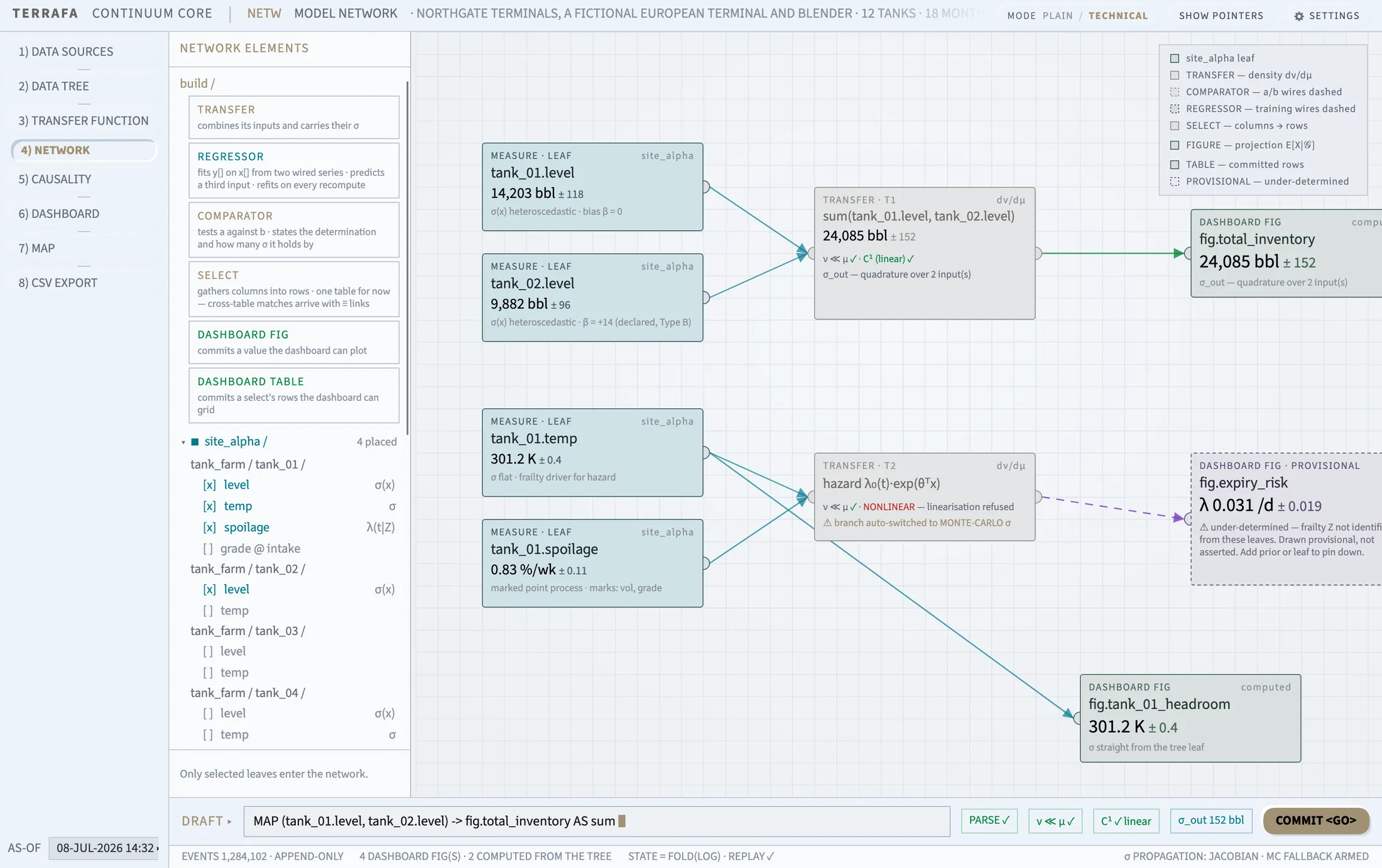
- Right-click the node you want to publish.
- Choose Publish as Dashboard Fig, or Commit as Dashboard Table.
- Type a name. Terrafa Continuum previews the resulting slug as you type, for example
fig.tank_level, and warns you if the name is already in use. - Click Commit.
Tag a node with facets
- Right-click a node and choose Modify Facets.
- Click an existing facet value to turn it on or off for this node.
- To add a new value, type it and press Enter.
Other node actions
Right-click a node for further options, depending on its kind: Clear Inputs, Remove from Diagram, Change Operator or Swap Wires A/B on a comparator, Change Function or Modify Function on a transfer node — which jumps to the Transfer Function tab — and Swap Training Wires or Rotate Port Roles on a regressor.
The top-right corner of the canvas holds a legend explaining the color and line conventions: dataset colors, dashed comparator wires, dashed training wires, and the purple provisional state for under-determined nodes.
Dashboard
Arrange your figures and tables into tiles
Screen layout — elements on the left, tile editor on the right.
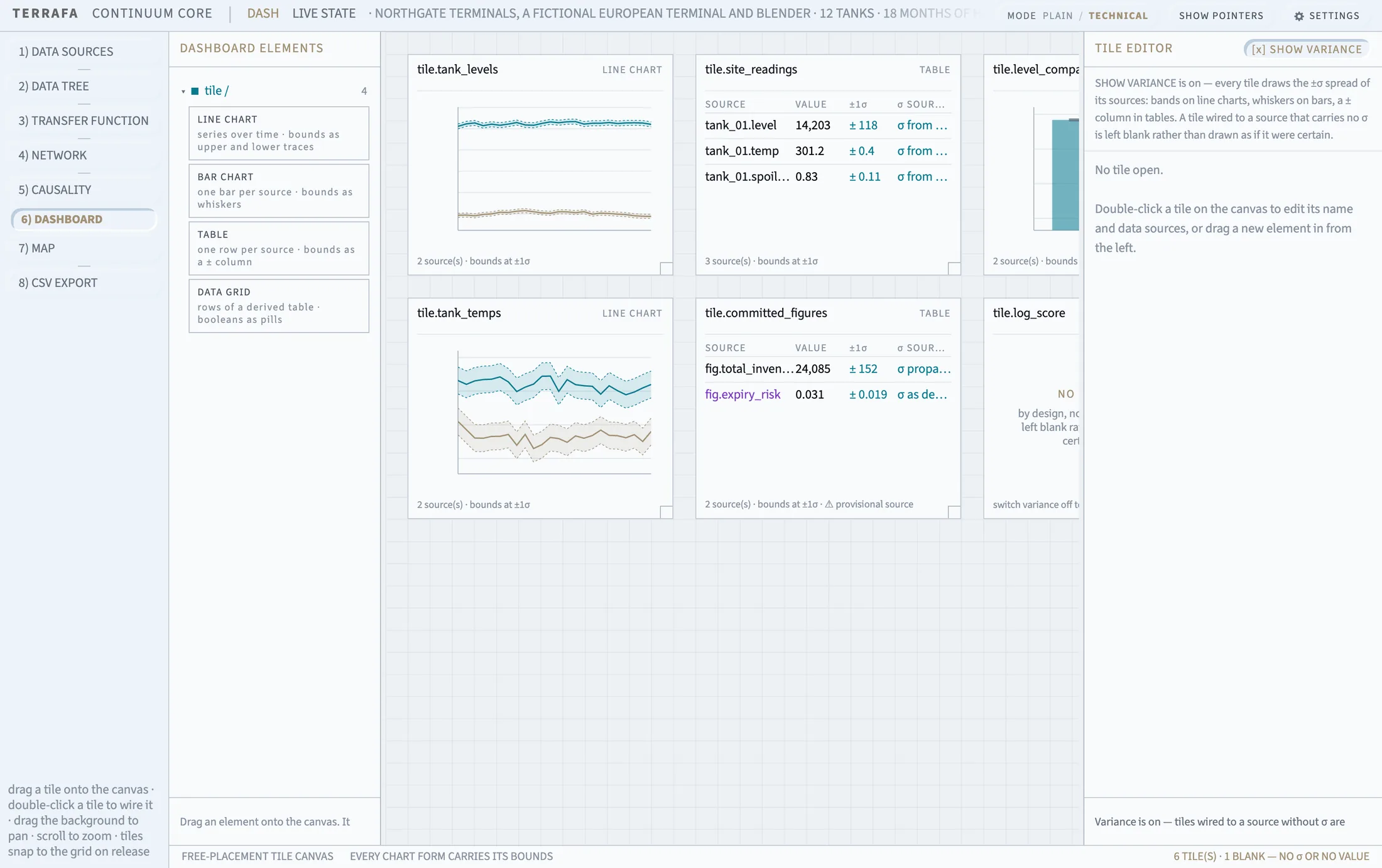
The Dashboard tab arranges the figures and tables you published from Network into tiles you can read at a glance.
Add a tile
- Open the Dashboard Elements panel on the left.
- Drag a tile kind onto the canvas: Line Chart, Bar Chart, Table, or Data Grid.
- Terrafa Continuum drops the tile where you release it, snapped to the grid if snap is on.
Work with tiles on the canvas
- Drag a tile to reposition it.
- Double-click a tile to open it in the Tile Editor.
- Right-click a tile for Edit Tile, Duplicate, or Remove from Dashboard.
The tile editor
The editor panel on the right opens one tab per tile you are editing.
- Name renames the tile. The new name updates its tab and header at once.
- Chart type switches the tile between Line, Bar, Table, and Grid.
- Data sources lists dashboard figures and dataset measures. Tick a source to wire it into the tile. Grid tiles use a single table picker instead.
- Grid options — for Grid tiles, choose which column leads under Index, and turn on Highlight Booleans to color true and false values.
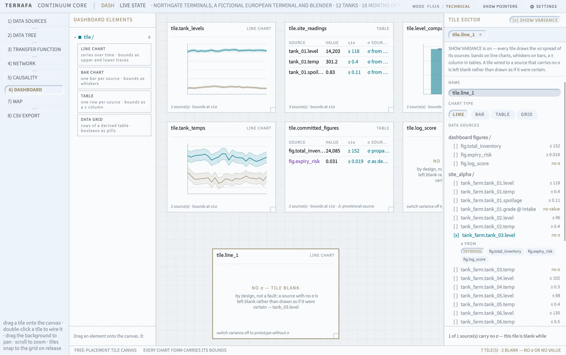
Show variance
Show Variance is a master switch above the editor tabs. It controls whether every tile draws its ±σ bounds: bands on a line chart, whiskers on a bar chart, a ± column in a table.
Turn variance on to check which tiles are missing uncertainty. A tile wired to a source with no σ draws blank rather than show a false value.
Borrow a σ value
A measure with no σ of its own can still show one. In the tile editor, use the σ-from control next to that source and choose a figure to borrow uncertainty from. Choose Intrinsic to use the source's own σ instead, where it has one.
Map
Pin live readings onto your site plan
Screen layout — tools panel on the left, plan fills the rest. This is the first tab you see on launch.
The Map tab pins your live measurements and figures onto an image of the physical site, so a number reads in its physical context.
Set your site image
- Open the Tools panel on the left.
- Under Site Image, click Upload Image, or drag an image file directly onto the plan.
- Terrafa Continuum replaces the plan with your image.
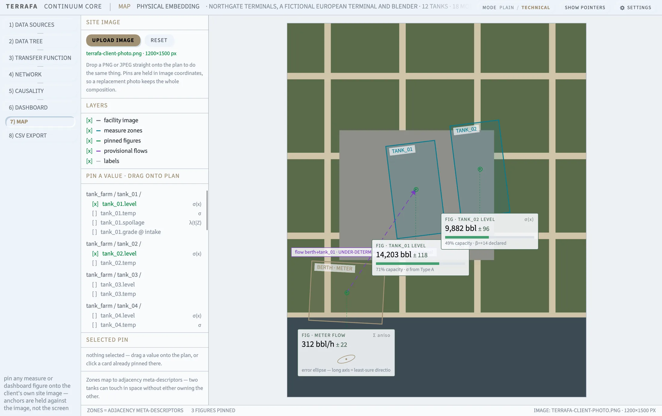
Click Reset to return to the generated placeholder plan.
Choose what shows on the plan
Under Layers, turn five elements on or off independently: facility image, measure zones, pinned figures, provisional flows, and labels.
Pin a value onto the plan
- Scroll the catalogue under Pin a Value, on the left. It lists every measurement and dashboard figure you can pin.
- Drag an entry onto the plan.
- Release it where you want the pin to sit.
Move, inspect, or remove a pin
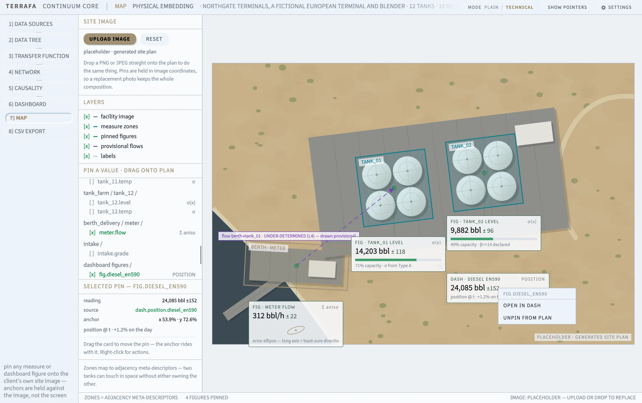
Click a pin to select it. The Selected Pin panel on the left shows its reading, source, anchor position, and any detail text.
Drag the pin's card to move it — the anchor point on the image moves with it. Right-click a pin for Open in Dash or Open in Network, depending on where the value came from, or Unpin from Plan.
Provisional flows
A dashed arrow between two zones marks a relationship Terrafa Continuum has not fully determined yet. Its note bubble explains why — for example, that the flow is under-determined.
CSV Export
Build a large table and export it as CSV
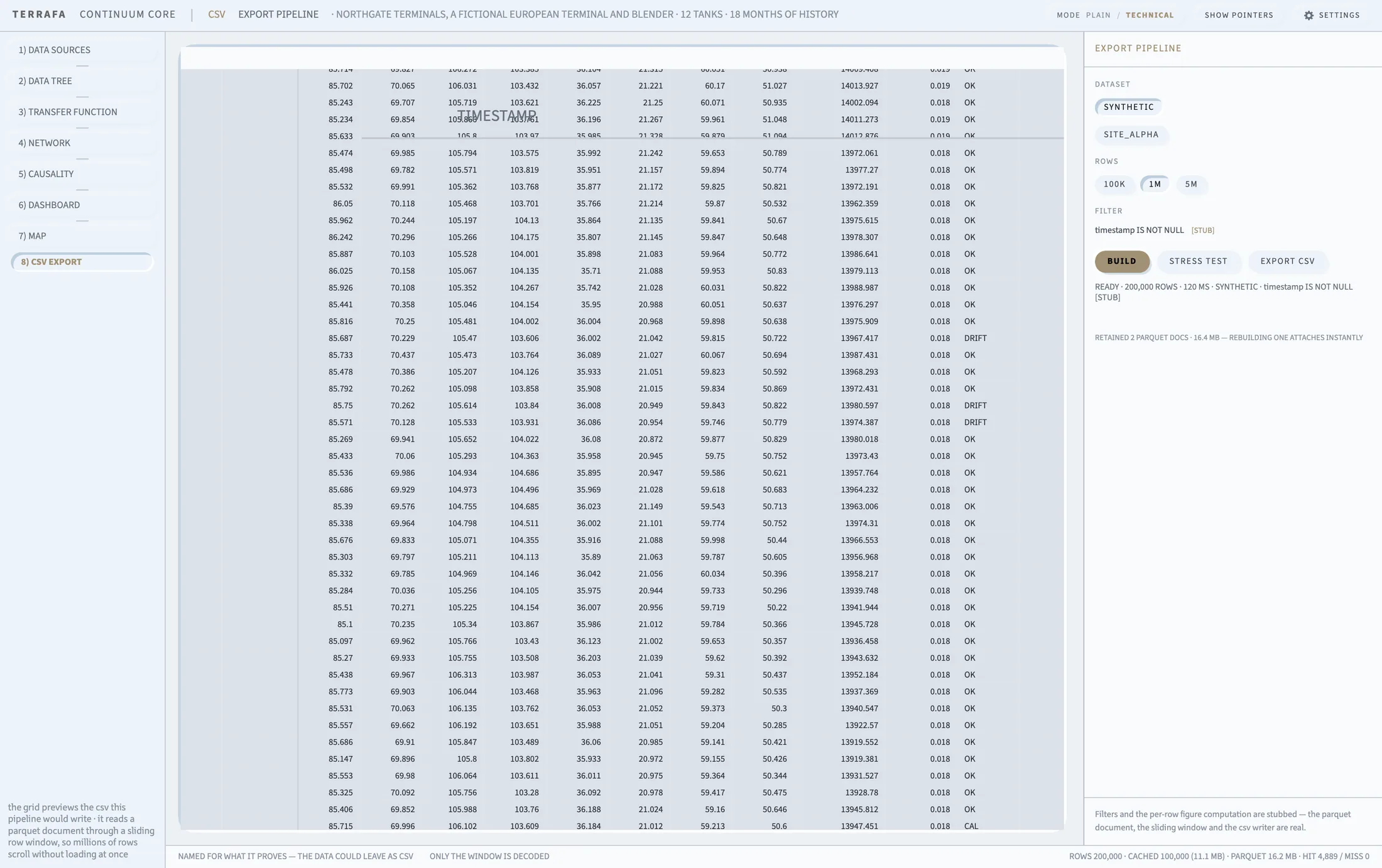
Screen layout — the preview grid fills the center, the export pipeline sits on the right.
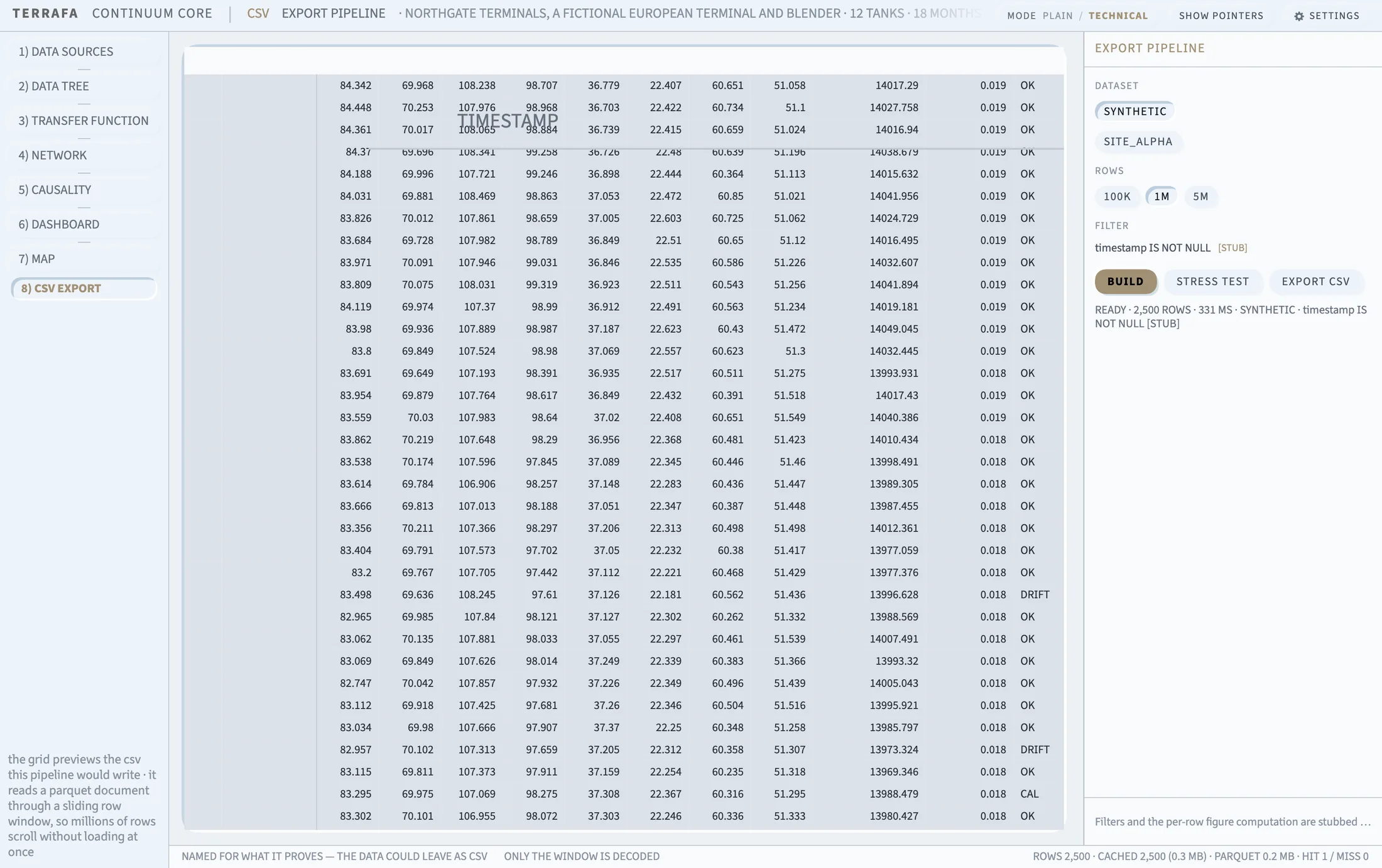
The CSV Export tab builds a large table and lets you preview and export it as a CSV file, streamed through a windowed grid so even a table of millions of rows scrolls smoothly.
Build a table
- Under Dataset, choose the synthetic dataset or any dataset you have mounted.
- Under Rows, choose a size: 100K, 1M, or 5M.
- Click Build.
The build status readout reports progress, then the row count and build time once it finishes. Click Stress Test to build immediately at the largest size, 5M rows.
The filter row shows an example expression but does not yet filter your build. The parquet document, the sliding row window, and the CSV writer are real.
Preview the table
The grid in the center previews your built table. It reads the underlying parquet document through a sliding window, so scrolling through millions of rows does not load them all at once.
Export to CSV
- Click Export CSV.
- Choose where to save the file.
- Terrafa Continuum streams the table to CSV and reports progress as it writes.
Retained documents
Terrafa Continuum keeps recently built tables in memory. The retained documents readout reports how many, and their combined size. Rebuilding a retained table attaches to it instantly instead of building again.